Showing posts with label OUCS106. Show all posts

Tuesday, 29 March 2011

Semiotics


This is a great example of mis-informed expectations.  Rosie is displayed posing topless, smiling at the camera and wearing the absolute minimal.  Most men would admire the image and move on, without reading the small article to go with the image.

She comes across as intelligent and informed, and backs up her views effectively.  But the fact that the article itself is so tiny proves The Sun has purposely rejected it, giving her a stereotypical glamour model impression.  They have framed her as an object, rather than a human being, whereas her intelligence would most likely excel many of the readers that have automatically ranked themselves higher than her.

Sunday, 27 March 2011

Deconstruction


Throughout history, text as communication has been developed into a set format in which to be read.  Single sentences are broken down with the use of punctuation, multiple sentences are gathered and separated accordingly with the use of paragraphs, and a selection of paragraphs are often organised into sections.  It is these set of rules that divide text from speech.  A typical typographic page is neat, organised and finished, whereas speech is spontaneous, chaotic and on-going.  This forms the basis of deconstruction: the exploration of text as a natural form of communication.

French critic Roland Barthes believed in two variations of writing: the “work” and the “text”.  The “work” corresponds to a neat, finished and printed product, whereas the “text” is a muddled brainstorm of ideas displayed as writing.  It is the “text” that responds to speech and is explored within deconstruction as a style. 

Another one of Barthes’ views is that ‘the reader “plays” the text as a musician plays an instrument’.  By forcing the viewer to interpret their own meaning within the text, they are generating their own views and therefore “playing” the text.  It is treated as a game, to encourage people to obtain something by “playing” it in the best way they can.  How the text is used creates a unique understanding for the person using the text.

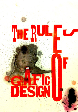
The digital age presents more design possibilities and opens doors in the experimentation of deconstruction, as the manipulation of letterforms is a relatively straightforward process.  It is argued that a typographer’s use of negative space is just as important as their placement of letterforms.  The space in which nothing appears conveys meaning more than people think.

The modern generation are exposed to so many advertisements that they tend to have a lower attention span than people in the past.  Unfortunately, the world is very driven by advertising and selling an idea, that there isn’t enough time to absorb all the information they receive.  They have a choice in what to take in, so the designer’s role is to help them make effective choices.  A huge headline followed by small print isn’t supposed to be a conventional way of displaying text, yet it is present in magazines, newspapers and posters etc.  This is relative to speech in a way that the bold headlines represents someone shouting, and devices such as pull quotes are the key points that someone would tell you before going into detail.

David Carson’s work responds to the deconstructive style by creating his own meaning in the typography itself.  He forces the reader to change their way of reading, against the traditional left to right, by introducing vertical alignments and rotated letterforms.  It makes the reader think about it by abolishing the grid system and introducing an abstract order.  My interpretation of the piece is that graphic design is more effective minimal, due to the hollow box the type creates.  This is because he utilises the space, and creates impact on something that isn’t there.  Somebody else may have a different viewpoint; it just depends on how we “play” the text.

Analysis of the Text - Deconstruction


Thursday, 24 February 2011

Post-Modernism

Post-Modernism is the direct response to the forces of Modernity and Modern art.  It strives to be the opposite of the clean-cut, minimal approach that the Modernist designers had in their work.  This movement ignored strict layout, whilst including bright colours and complex typefaces.  Post-Modern work often got a negative response from the public because of this, but stood out as a clear rebellion against the norm.


I believe Post-Modernism was more of an attitude than a design movement.  It involved unsightly colours, sharp and jagged typefaces and the defacing of respected public figures.  Because it was so anti-ordinary, it also pushed the boundaries of design and encouraged more experimentation past the clean, neat and strict Modernist work.

Elvis Has Left The Building (Artist Unknown) 1980
http://www.johnnypunish.com/blog/2010/06/protest-guitars/

The Clash were renowned for their 'underground' music and way of life.  The designer replicated this in a poster by adding a threshold effect and layering the type in a careless manner.  It reflected the urban and grungy qualities the band had, and is an example of the rebellion against the ordinary.

 God Save The Queen, Jamie Reid, 1977
http://madamepickwickartblog.com/never-mind-the-bollocks-heres-the-black-bloc/

This is an example of work that is made to be offensive, to provoke some sort of backlash from the nation.  By defacing the Queen, a worldwide figure and a representation of English history and tradition, Jamie Reid created an instant intimidating atmosphere to the piece.  To me, it looks as though the Queen is being taken hostage, which is a very frightening scenario.  This interpretation is what, I believe, makes this a post-modern design.  It is all about the attitude, rather than the aesthetics.

 i-D Cover, Terry Jones, 1980
http://shanny12.wordpress.com/modernism-vs-postmodernism/

The cover of the i-D magazine is a terrific example of post-modernity because it conflicts Modernity on so many levels.  Firstly, the colours used are bright and unsightly, there is no real centre of attention on the page. Jones has used collage elements in the work with the eyes and used a broad range of distorted typefaces.


 Never Mind The Bollocks album art, Jamie Reid, 1977
http://www.virginmedia.com/music/pictures/toptens/best-album-covers-ever.php?ssid=19

This is an example of work that ignores any kind of typographic harmony throughout.  The pink banner displays varying fonts, sizes and angles that certainly fight against the minimal work of the Modernists.  It goes against their clean ethics by representing something that looks screwed up, thrown on the floor and trodden on.

London 2012 Olympics Logo, Wolff Olin, 2007

This is the very infamous 2012 Olympics logo, which has received a lot of bad reception after its release in 2007.  The style is very reminiscent to the punk movement, and incorporates the same bright colours as the 'Never Mind the Bollocks' album 30 years prior to this.  The logo also had the same public response; provoking disgust and refusal.

Avante Garde

Avante Garde is a French term, established in the 19th Century, that celebrates new and innovative art.  It applies to original, well thought out pieces that have never been seen before.  This term is also applicable to Graphic Design, and I feel that it responds to how the piece is presented as much as the discovery of a new style or technique.  With the development of technology and processes, there are more possibilities than ever before in terms of placement and execution of design.  For example, design can be sprawled across buildings or reduced to the size of a postage stamp; it can interact with the environment and provide an impact on the public.  The foundations are there to create a completely Avant Garde piece, which some have already taken advantage of.


Contemporary Graphic Design often incorporates interactivity, and companies are forever looking for newer, more appealing methods of delivery.  This incredibly simple, yet eye-opening awareness device compels the user to crumple the car to get to the product.  This is a fresh way of forcing a problem upon the viewer, and makes them think directly of the consequences.  This piece of design would be considerably less effective on a piece of A3 paper, yet on a simple item such as a bottle top it is considered an original and innovative piece of design.

http://www.behance.net/gallery/TYPE-SEX-WITH-DUREXa/411957

The Durex ad introduces a new spin on the promotion of condoms.  Instead of encouraging safe sex, it promotes the enjoyment of sex and in particular the enjoyment of the product itself.  It displays this in a very erotic manner, but never actually exposes any naked flesh.  All the advertisement consists of is descriptive text and the company logo, arranged in a way that forms an image to match the ethos of the product.  What is essentially a typographic poster has been distorted and shaped to form a series of recognisable forms.

Thursday, 20 January 2011

'The Shock of the New' Section Analysis

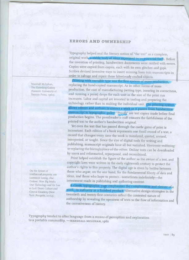
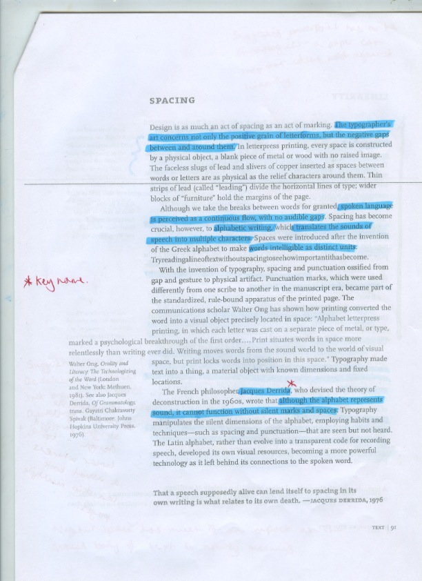
This is research for my essay, where I read and highlighted key points on 'Trouble in Utopia' in The Shock of the New by Robert Hughes, 1991.


Tuesday, 14 December 2010

Lecture Six - Postmodernism


Lecture Five - New Media & Visual Culture

  • The way we read has changed because of hypertext.  Links to another page paves the way for controlled reading - not linear.
  • Images themselves are read alongside text.
  • Mass media is seen as negative as it is very corporate and is solely driven to make money.
  • The audience don't have much chance to change anything, mass media is in control.
  • People see it as bland as the output is repetitive, boring and focused on profit.
  • Related to drug use because people will want more of what is popular.
  • Mass media is seen as positive as it can boost the attention of deserved people or companies.
  • It promotes creativity as people want to push the boundaries of modern society.
  • Benetton used the mass media to feed people controversial ads.  It was seen as immoral by some, and something new from others.
  • Printing processes are making it possible to gain a bundle of high quality prints in a short amount of time -  daily newspapers and magazines.
  • Revisited styles and modernising from the early 20th century.
  • Pear's soap took a piece of fine art and made it into an ad - took away the pureness of the artists' work.
  • Science fiction is more possible due to the special effects made - people are believing more.

Lecture Four - Advertising and New Media


Lecture Three - The Document


Lecture Two - Graphic Design: A Medium For The Masses


Lecture One: Modernity & Modernism - An Introduction

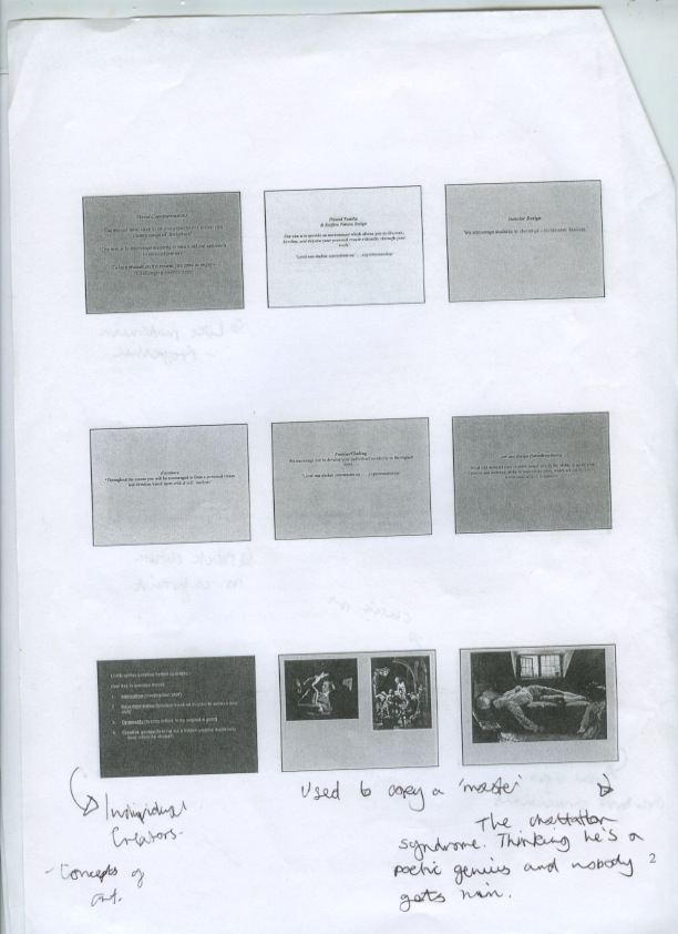
  • What we see as 'classic' now was once seen as modern.
  • 'The Hierling Sheperd' by William Holman Hunt (1851) introduces a concept rather than just being a nice painting.
  • Ideas were starting to develop to make the audience think.
  • Industrialisation is responsible for the availability of new materials.
  • Paris was seen as a central figure in the adaption of Modernism, the painting 'Paris on a Rainy Day' (1877) doesn't centralise a person but the city itself. 
  • Bauhaus' form follows function ethic takes away the ornament.
  • Modernist's stayed true to the materials, not masking anything.
  • Modernist's started to make for mass production.
  • Harry Beck's underground map is an example of a work that strips down everything to it's purest form, creating an easy to understand version of a very complicated system.

Tuesday, 23 November 2010

5 Modernist Images

www.bauhaus.co.il

The strict layout, simple colour scheme and sans-serif font make this a modernist design.  Modernist's introduced a slanted layout that was apparent in a lot of their posters, which became another characteristic of modernist design.

blog.geyrhalter.com

Another Bauhaus poster follows the angled layout of the one above.  Again, a sans-serif font is used for simplicity and the 3 colours and stock make this a modernist design.

www.metaphorical.org

El Lissitzky was a famous Russian designer that helped define the modernist style.  His work influenced the work of Bauhaus and this typographic poster defines layout and has some sort of symmetry

www.rightreading.com

Jan Tschichold revolutionised the design of Penguin Books.  The simple colour scheme, neat typographic layout and the crisp, sans serif font follow the modernist style.

www.treadwaygallery.com

Walter Gropius' furniture was modernist as it stuck to the rule: form follows function.  It made no attempt to mask what was essentially wood and cushion.