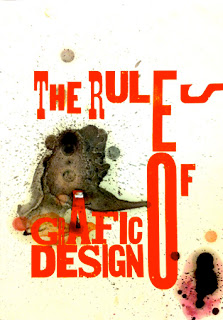
Throughout history, text as communication has been developed into a set format in which to be read. Single sentences are broken down with the use of punctuation, multiple sentences are gathered and separated accordingly with the use of paragraphs, and a selection of paragraphs are often organised into sections. It is these set of rules that divide text from speech. A typical typographic page is neat, organised and finished, whereas speech is spontaneous, chaotic and on-going. This forms the basis of deconstruction: the exploration of text as a natural form of communication.
French critic Roland Barthes believed in two variations of writing: the “work” and the “text”. The “work” corresponds to a neat, finished and printed product, whereas the “text” is a muddled brainstorm of ideas displayed as writing. It is the “text” that responds to speech and is explored within deconstruction as a style.
Another one of Barthes’ views is that ‘the reader “plays” the text as a musician plays an instrument’. By forcing the viewer to interpret their own meaning within the text, they are generating their own views and therefore “playing” the text. It is treated as a game, to encourage people to obtain something by “playing” it in the best way they can. How the text is used creates a unique understanding for the person using the text.
The digital age presents more design possibilities and opens doors in the experimentation of deconstruction, as the manipulation of letterforms is a relatively straightforward process. It is argued that a typographer’s use of negative space is just as important as their placement of letterforms. The space in which nothing appears conveys meaning more than people think.
The modern generation are exposed to so many advertisements that they tend to have a lower attention span than people in the past. Unfortunately, the world is very driven by advertising and selling an idea, that there isn’t enough time to absorb all the information they receive. They have a choice in what to take in, so the designer’s role is to help them make effective choices. A huge headline followed by small print isn’t supposed to be a conventional way of displaying text, yet it is present in magazines, newspapers and posters etc. This is relative to speech in a way that the bold headlines represents someone shouting, and devices such as pull quotes are the key points that someone would tell you before going into detail.
David Carson’s work responds to the deconstructive style by creating his own meaning in the typography itself. He forces the reader to change their way of reading, against the traditional left to right, by introducing vertical alignments and rotated letterforms. It makes the reader think about it by abolishing the grid system and introducing an abstract order. My interpretation of the piece is that graphic design is more effective minimal, due to the hollow box the type creates. This is because he utilises the space, and creates impact on something that isn’t there. Somebody else may have a different viewpoint; it just depends on how we “play” the text.


No comments:
Post a Comment